Veneer pins.

One of the most valuable things I’ve gained from being a student at the Chippendale International School of Furniture is access to antique, and even ancient, furniture that I’d only ever seen in books and online. We have visited homes and museums and have enjoyed access to furniture that I didn’t know existed. We have also had access outside of school to auctions and antique shops where I’ve fondled and caressed (not in a creepy way) beautiful antiques and vintage pieces of furniture for much longer than was appropriate.

Late 17th C. Oak Coffer

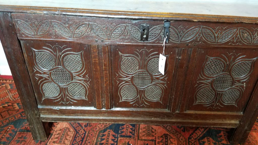
Late 18th C. George III Style ‘Chinese Chippendale’ Mahogany Urn Stand
Mid Century Modern Le Corbusier

I’ve been taught since I was young that when at any museum, or in the vicinity of delicate antiques, you ‘look but don’t touch‘ , so it’s been an amazing treat to be able to visit museums and homes and have that extra bit of access where you can touch the pieces, pick them up, turn them over and look at the underbelly because, in order to really understand how furniture was made, you have to look under, inside, and behind that piece. I first learned this from a blog, Pegs and Tails, that I’ve been following for a few years, and also from Peter Follansbee’s blog but since starting my furniture class I’ve had a chance to experience this first hand.

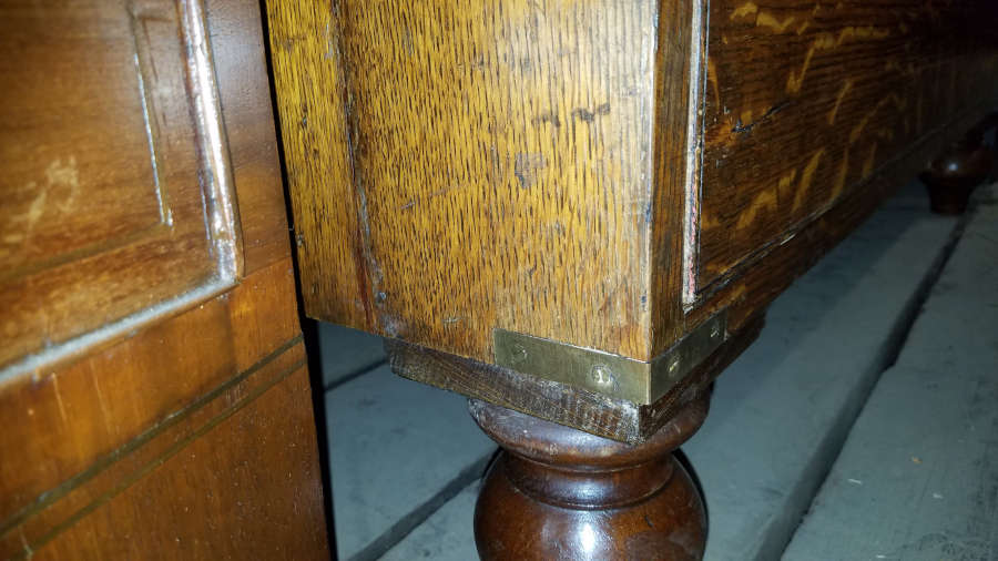
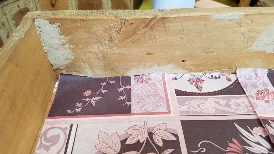
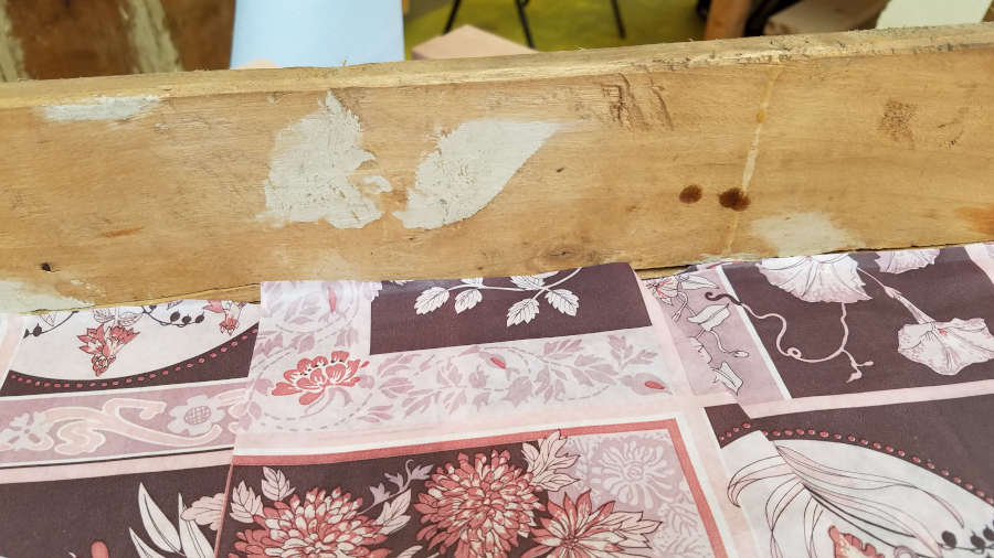
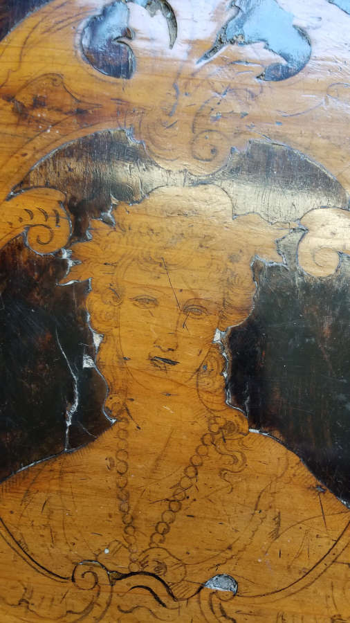
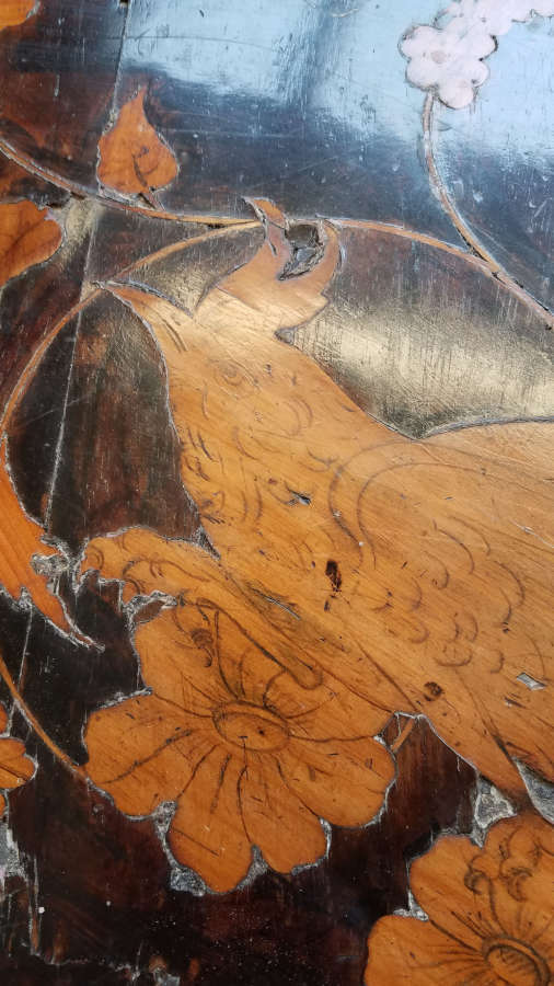
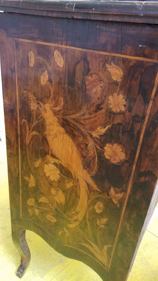
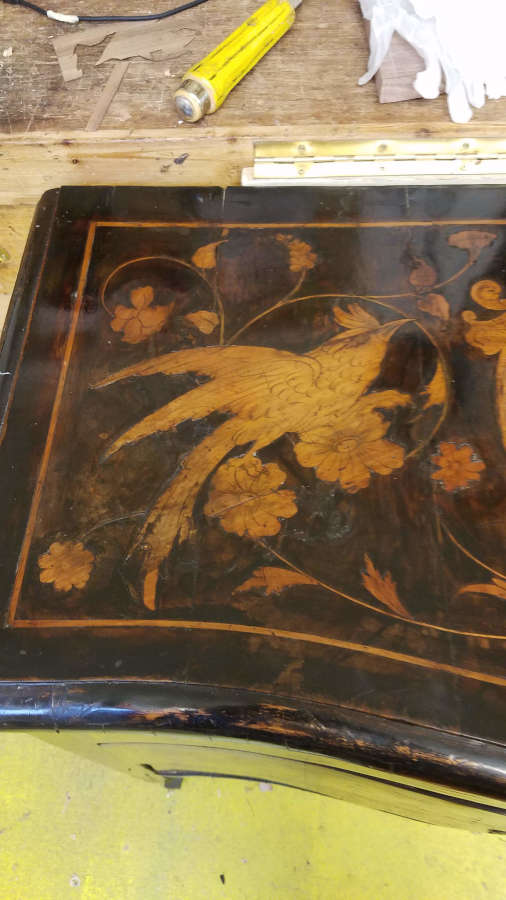
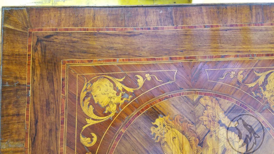
I’ve been able to see and help work on some wonderful pieces of furniture that have come in the School since I began my classes. From damaged chairs to cabinets, desks, dressers, and tables, they have all fascinated and intrigued me, but one particular moment that stands out to me is when a late 18th C. (around 1780) Italian table came in for repair/restoration. I’d not seen a piece like this before, but was immediately drawn to it because as soon as I started looking closely I could see so many wonderful and intriguing things about it.

Late 18th C. Italian table needing some TLC.
Closer view of the top.

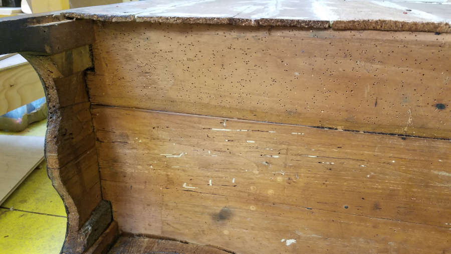
But the one thing that caught my eye was when I saw some holes in the veneer and marquetry that didn’t look like normal wear and tear.

I knew that I remembered seeing this somewhere, so I went back to some blogs I follow and found it in the Pegs and Tails blog in a post called “A Thorny Subject” dated 15 Jan 2012. He talks about veneer pins, which were used in period veneer work. They were made of thin sheet steel and guillotined or sheared with a taper. The edges were sharp enough to cut fingers so they were made to cut through the veneer instead of wedging into it. I’ve not found any sheered veneer pins for sale today (only round), but it may just be that my Google-Fu skills are rusty.

Per the article, the veneer pins were often used on uncooperative veneer in corners, on either side of a split or joint, or anywhere the veneer refused to cooperate.

Some of the pin holes are circled.

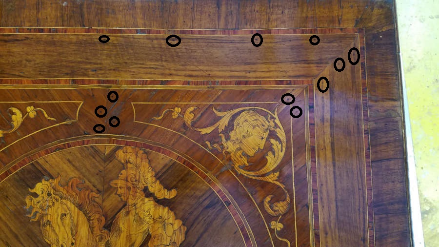
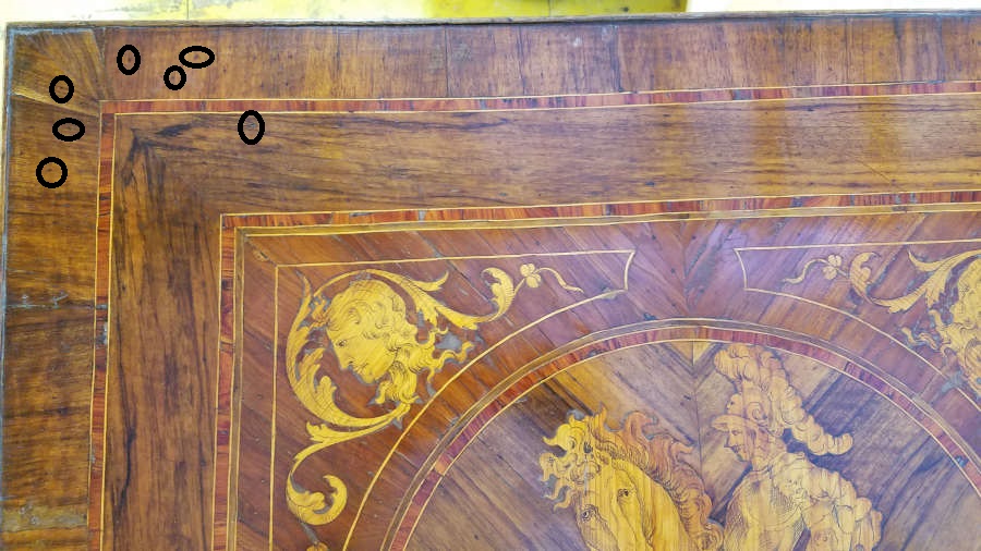
This was one of those ‘Eureka’ moments for me and just drove home the fact that I’m intrigued by the methods and tools used by pre-industrial furniture makers and crafts people. I was fairly bouncing around the table, babbling like an idiot about these pin holes because it tied together things I’d read about to things I was able to experience. And quite often, making it real is the catalyst for education.

Military Campaign Furniture

I’ve recently (within the past year) become interested in Military Campaign Furniture. This is something that could, and has, filled books. The one that I have is now very well worn as I have been using it almost every day for a project I’m working on. Campaign Furniture by Christopher Schwarz at Lost Art Press has been indispensable for most of my research on Military Campaign Furniture.

https://lostartpress.com/collections/books/products/campaign-furniture

I like sticky notes.

That said, I’ve also chatted with Simon Clarke at Christopher Clarke Antiques, who specialize in Military Campaign and Metamorphic furniture. They have a blog as well that I’ve used quite a bit, but more than that Simon has been very helpful in answering questions I’ve had about the furniture.

And I’ve also found that Pegs and Tails has quite a bit of valuable information on Campaign furniture as well. You’ll see that I refer to Pegs and Tails quite often as it has become my source for period furniture construction techniques and antique furniture identification more than any book or any other website.

So before I even knew what my Campaign piece would look like, I had already been researching the style and construction for a while. I knew I wanted to make something that I could take up and down narrow stairwells without too much trouble. I knew that I wanted to use brass hardware. And I knew that I wanted something very sturdy, which is what Campaign Furniture was designed for. After that, I had to figure out what it would look like.

I started out with something closer to a side table. It was high enough to use as a writing surface, which started me thinking about a desk.

Figuring out proportions.

I then added a second chest, slant front, lopers and a gallery for my desk.

I was almost ready to start prepping the lumber.

But the slant front wasn’t doing it for me so I thunk, and thunk, and then thunk some more and decided on a pull out gallery. From this point I don’t have drawings as I had putzed away so much time up to now I had to get started.

One of my other favourite books in the background, Scottish Vernacular Furniture by Bernard Cotton.
This option would use quadrant stays instead of lopers to support the writing surface.

I had already figured out the gallery portion and knew the height and depth.

I then worked out the height of the desk, compared to the height of the chests and figured out the height of each drawer.

I was finally ready to start constuction. In my next post.

Campaign Style chest. Part 1

One thing about building Campaign Style chests is you gotta love the dovetail. Alot.

Hogged out the majority with an electric router.

The dovetails were easily the most intimidating part of the carcass build, so I wanted to practice before I started on the project. I had some scrap pieces of beech that I thicknessed to be the same as the chest would be. I found an excellent tutorial for full blind and secret mitre dovetails at http://www.mikes-woodwork.com

There are so very many videos and blogs that show and/or describe how to make standard through and half blind dovetails, but there are surprisingly few that show how to make full blind and secret mitred dovetails. Even so, I did find several to choose from and always came back to the mikes-woodwork site. His instruction really worked for me and I used it for all subsequent dovetails for the project.

The reason I was looking into the full blind and secret mitred dovetails is that they were used in period pieces, mostly for the top corners. I checked some pieces locally and found that some had half blind and some had full blind, but I haven’t found a secret mitred carcass yet.

And just a warning. I’ll use “half blind” and “half lap” dovetails interchangeably so if you see me change from one to the other in mid-thought I’m still talking about the same thing.

Laying out my lines.
The three pieces with the rebate.
Cut your pins first. It is easier to transfer the pins to the tails with this kind of joint.

Several years ago when I was just beginning to play with joinery, I learned to cut pins first. Not because I watched Frank Klaus or anything like that, but because I found it to be much easier to transfer the pins to the tails. At the time I thought I was cheating or doing it wrong, so I then learned to cut tails first. Since the question, Pins or tails first, has become such a volatile debate, I don’t usually say which way I think is best. That said, I haven’t made enough dovetail joints to even be considered a beginner.

With full blind dovetails you don’t have to worry as much about the proportions of your tails to pins, so make them both big.

I used a mitre jig to reference my chisel from the top and bottom.
And for my first try it wasn’t too bad. Surprisingly little cursing and hardly any crying at all!

Even though my trial run on the hidden mitred dovetail went OK, I decided not to use them in the project. Instead, the two top corners are full blind dovetails (without the mitre). I didn’t take pictures of that procedure but will do so for my next Campaign piece. I did take a picture of the pins though.

Some of my scribbling.

For the backs of these pieces (Chests and Secretaire) the norm was to use a simple boarded back that was screwed into the rebates in the carcass. Another method was a frame and panel. I chose a modified version of the frame and panel for mine. I used mostly offcuts for the frame and panel, but for the frame I needed non-spalted straight grain.

Frame and panel back for Campaign style chests.
My frame and panel back.

The back frame is 12mm thick (about 1/2 inch). I used a half lap here since I didn’t want to fiddle with mortise and tenon that small. The panel is slightly thinner and goes into a 5mm groove in the frame.

Web frame (webbing) for between the drawers.

I had some leftover bookmatched flame beech but it wasn’t long enough to use for the backs, so they ended up in the webbing between the drawers. The web frame is the same thickness as the carcass or 18mm (about 3/4 inch). For this, I used mortise and tenon.

While searching for scrap beech I could use for the frames, I came across some oak that was the right length and thickness, so I laminated a piece of flame beech on the front and called it a day.

And I have a couple of boxes. Getting ready to build the drawers and gallery next.

The flame is beautiful, but I was not careful with this and damaged the soft wood on the left side.

To be continued…

Visiting a Mid Century Modern home. *Patty, this one’s for you.

Our class at the Chippendale International School of Furniture recently visited the Woodcote House in Midlothian, Scotland. This was only one of several “field trips” that the class went on and was a wonderful and extremely valuable experience for me. I’m not a furniture designer, nor do I play one on TV, but I have designed (to some extent) all of the pieces I’ve made so far and am making now. The most interesting part of this though is that I’ve never really been attracted to the Mid Century Modern style, so it was a thoroughly pleasant and welcomed surprise for me to find that this visit was the most interesting and valuable to me of all of our field trips.

***Note*** That does not mean the other field trips were not each valuable. I found each of these visits to be eye-opening and wonderful with the up close and personal access to old and absolutely breathtaking pieces of furniture and art with the stories and history behind them.

Eleanor Morris of Woodcote, PhD, PCRTPI Scotland was our very gracious hostess and an invaluable wealth of knowledge of the furniture there. She gave us the history of each piece and its significance to Scotland, with some great personal stories behind many of them. Unfortunately, I do not have a great (or even good) memory and can’t remember even one of those stories…but they were great!

Probably the most iconic piece we saw was the Le Corbusier Chaise Longue a Reglage or the LC4 or, I think, the B306, which sounds like a military bomber jet.

Le Corbusier Chaise Longue.

An early version of this had taller back legs. This one has a calfskin seat with chrome tubing and rubber guides so the seat frame doesn’t slip and slide while you are trying to sit down. It was designed by Le Corbusier, with Pierre Jeanneret and Charlotte Perriand. It has been in production since the 1930s, first made by Thonet and since the 1930s by Cassina.

There were also a pair of LC3 Grand Confort “Cushion Baskets” from about the same time in calfskin.

Le Corbusier LC3 Grand Confort (not a misspell) Cushion Baskets.

I sat in one of these for a bit, and even after 54 plus years (at least as old as I am) they are still very comfortable.

Next are some pieces by Mies van der Rohe. The Barcelona chairs and divan.

A pair of Barcelona chairs by Mies van der Rohe.
Barcelona divan (couch, daybed) in leather and possibly African Mahogany with a steel frame.

The couch was designed for a New York architect in the 1930s and became famous when it was shown in the Glass House, which was completed in 1949 in New Canaan, Connecticut.

Knoll took over production in 1964 and it wasn’t until 1987 that the divan was called the Barcelona (like the chair) because of its resemblance to the chair.

Les Arcs chair

The Les Arcs resort chair, by Charlotte Perriand (or Italian designer DalVera). I’ve seen some pictures of these with black steel tubing. They were designed for the Les Arcs ski resort in Savoie, France.

Tulip table and chairs.

The Tulip table and chairs by Eero Saarinen were the first pieces we saw when we entered the house. The chairs were surprisingly comfortable and sturdy, even for a heavier person as myself. The table caused a bit of a stir when it came to Scotland. Seems that for safety reasons it was supposed to have two bases. Even with a half dozen of us sitting at the table, it was never tippy or unstable.

Wassily chairs.

Marcel Bruer was influenced by the De Stijl movement while an apprentice at the Bauhaus and drew on the bicycle frame as inspiration for the Wassily chair in 1925.

Several of the other students sat in these chairs and said they were quite comfortable.

There were quite a few other very memorable pieces at the house, but they will have to wait for another post.

Campaign Style Furniture design, part 1: brass hardware, straps and corner mounts.

Campaign furniture spanned more than 200 years of English furniture periods from the Georgian through to the mid 20th century. Even though it was around for so long the campaign-style did not change much in those 200 years, which could be attributed to a couple of factors. First, since the furniture had to be mobile and sturdy for use on or near battlefields there are arguably a limited number of ways to build that furniture. Second, the clientele were military officers to begin with, who tended to be staid, conventional, and reserved in their tastes and styles.

I believe the first campaign furniture was made for British naval officers in the early Georgian period (the early 1700s). I’ve perused the Christopher Clarke Antiques Blog and Christopher Schwarz’s book and haven’t found anything definitive on this and will probably follow up with more posts on the history itself.

One feature of campaign furniture that tends to stand out (and is used heavily in contemporary interpretations) are brass coloured straps and hardware.

Brass coloured straps are a decorative element in modern furniture. You will likely find that on modern pieces the straps, corner mounts and related parts are not recessed and installed flush, but are proud of the surface. Another difference is that the straps and hardware will likely be fixed with tacks, pins, or small nails. You may also find the pieces glued to the carcass.

The utilitarian and mobile nature of Campaign furniture means that the brass hardware is functional as well as decorative. Brass straps and corner mounts protect edges and corners. Straps may also help to keep sides from bowing or flexing and creating gaps.

A corner mount.

Corner mounts will usually be flush with the wood, which requires time and effort and would be difficult to automate. The screws will be countersunk slotted screws and again flush so as not to catch on anything while moving it.

Brass straps.

The brass straps are also mounted flush and protect the edges and possibly keep the sides from bowing or flexing since they are of solid wood (mahogany, teak, or in this case, oak).

For part 2 I’ll talk about the drawer hardware.

A closer look at the 18th-century Italian chest.

In the previous post, I was working on the top of the chest but didn’t show any of the rest of the piece, so here goes.

The first thing I noticed when the piece came into the shop was the back.

It initially looked, and felt, like thin cement covering the joints but Graham identified it as gesso. This makes more sense because workshops would have had gesso available for painting (and gilding?)

This next picture made me think that most of the carcass may have had a gesso coating. The drawer side looks like it could have been covered, and then through the years the majority just wore away.

But then the inside of the drawer again looks like the gesso was used to cover gaps in joints, smooth dents, and fill holes. So I don’t think the gesso was used to cover the entire carcass, but I do believe it was added at a later date to cover gaps that developed as the lumber dried and shrank.

Next, I looked at the drawers. This along with the back of the chest brings up an interesting point. The craftsperson (craftspeople) who worked on this were very efficient with their time and energy. Non-show surfaces were not smoothed or scraped.

And, unfortunately, this piece had been a meal or two for some woodworms. Unfinished surfaces were given woodworm treatment as soon as the piece came into the shop.

This next picture highlights a couple of points. First, I think it re-enforces the idea that the gesso was a later addition to cover up the gaps made by dried and shrunken wood. Second, the non-show surfaces again show the efficient use of their time. The only smooth surface in this drawer space is the bottom where the drawer sanded it smooth from hundreds of years of use.

I eventually started looking at the show surfaces.

This marquetry is very similar to the table that came in a while back.

A portion of the Italian table that came in for restoration a while back. I’ll post more on this one later.

One thing about the marquetry is that the lines for the detail are not carved like first thought. They are drawn.

I didn’t think much of this at first, but when Graham needed to do some work on the table he discussed how important this detail is. If you have to use meths (methylated spirits – denatured alcohol) to clean or take off the finish for any portion, it can also erase the detail work so you have to be careful where and how you use any chemicals to clean a piece.

One major difference between the table and the chest is that the table is all marquetry and veneer with a clear finish, whereas the chest is marquetry and a painted veneer.

Painted veneer.
Veneer with clear finish.

Graham thinks this means the two pieces were made in the same shop, but the chest was a project for an apprentice. That makes sense to me and I’m running with that theory.

Arts and Crafts style mirror with gilding.

One project that really took me by surprise while at the Chippendale school was a mirror that ended up requiring more brand new skills than I would have thought possible.

I already knew that I wanted to do letter carving and I knew which quote I would use. I first saw the quote “The lyf so short, the craft so long to lerne.” in a picture of a fireplace mantel in a craftsman style home of Gustav Stickley, who was one of the first, and most well known, US mission (arts and crafts) style furniture makers. I then did some research to find out that it is from a poem by Chaucer, called “Parliament of Fowls” which is about how love and life are crafts that take a lifetime to learn. It is also thought to be the origin of St. Valentine’s Day. That said, I only knew it as a quote about traditional crafts and still think of it that way.

It started out as a simple drawing. At this point, I was so focused on my other project that I didn’t put a lot of thought into the scale or proportion, but I knew I wanted an arts and crafts style mirror.

This plan lasted long enough to start dimensioning the lumber and then went through several modifications (in my head). Then, when we ordered the glass I realized I had designed the frame too large, so it went through another major modification.

I thunk and thunk and then thunk some more over the resizing and what shape the mirror should take but had already started laying out the letters since the letter size and font would tell me generally what shape the mirror would take. I knew from the beginning exactly which font I wanted to use on this as I’d seen it used quite often for arts and crafts lettering, but I just didn’t know what it was called. I searched several font websites and found it on https://www.dafont.com/dyer-arts-and-crafts.font and also on https://www.1001fonts.com/dyer-arts-and-crafts-font.html

This is a public domain font and is free for all kinds of usage.

Dyer Arts and Crafts font.

I didn’t want the letters too small as that would make the carving more difficult so when I settled on a size I printed them out, cut and spliced them into their lengths and lay them out on the lumber. Here I needed to make sure my kerning was consistent because I was splicing groups of letters together.

I was worried that as I started to outline the letters onto the wood with the gouges that the letters would move and I’d lose my place, so I also used graphite paper (carbon paper) to trace the outside lines of the letters. This turned out to be overkill and actually created more work for me because I then had to remove the tracing afterwards, which turned out to be more difficult and fiddly than I had planned.

You can see the result of the tracing paper in a few of the letters.

The letter carving itself was very enjoyable and cathartic. I would be so engrossed in my carving that hours would fly by and I’d have to force myself to take a break, stretch, grab a cuppa, chat with the other students, and then dive right back in.

Once I’d reached a point that my rough out of the letters was finished, I shellacked the letters. This was to exaggerate the roughness and show me where I needed to concentrate my efforts to smooth the sides and the outlines.

I’d shellacked the top row, but not the bottom yet.

The roughing out of the letters was the quick part. I spent more than twice as much time smoothing the sides and edges.

After the rough out of the letters. Next I’m on to the smoothing.
Getting there.

Once I’d finished the smoothing of the letters, I was ready to stain and then gild. I later found out that this was the wrong order and next time I’ll gild and then stain. The reason being that when I finished gilding I had to sand the surface in order to create the crisp edges, but doing that removed most of the stain. I then had to restain after I had finished sanding. Not a huge issue as the restain cost me a part of a day and I had to let it dry overnight before shellacking.

I also had to regild the letters as I initially didn’t follow the tutor’s instructions correctly. Richard Walker at http://watergild.com/ was the visiting tutor for our gilding instruction and was great to work with. He never cracked a joke and we always knew when he was being serious. 😉 After realizing my mistake and regilding the letters, I sanded then restained using my super secret mix of water dyes.

Some of the testing I did for the mirror frame. Not all, but some.

After letting the stain dry overnight, I shellacked the front side. This was so I could finish staining the edges without it bleeding into the front.

As I was doing all of this I also worked on the side pieces and created the mount in the back to hold the glass. I don’t have pictures of that, but may add some at a later date.

I also didn’t take pictures of the glass/water gilding on the glass, and I’m really kicking myself now. That process was incredibly interesting and I can’t wait to do another project like this. Again, Richard was excellent to learn from as he was able to walk me through the process several times (I kept getting sidetracked on other stuff and would come back and say, “uh, I can’t remember what you said to do here”). Very patient and a great teacher.

First, I laid out the background, which was white gold (I think it has an Italian name, but can’t remember). Then, I scratched out the outline of the roses. For each rose I started with red gold, then added white gold to the center. I then scratched out the leaves and used green gold. I finished by scratching out the stems and then painted over the back with black acrylic paints. I’ve really condensed the process here because I don’t have a photographic record of the steps, but even though there are a lot of steps here and I had to wait overnight for the water to dry before I could move on to the next portion, it went surprisingly quickly. I will post pictures of the process when I do my next glass gilding project.

And the finished product, with 7 coats of shellac. I’ll add more pictures later.